Ajia ni Koishite(corporate)
View PC page
View SP page

Ajia ni Koishite(corporate)LP information
- Registration date 2026-04-13
- https://www.lotte.co.jp/products/brand/aji_koi/
- Product/service name
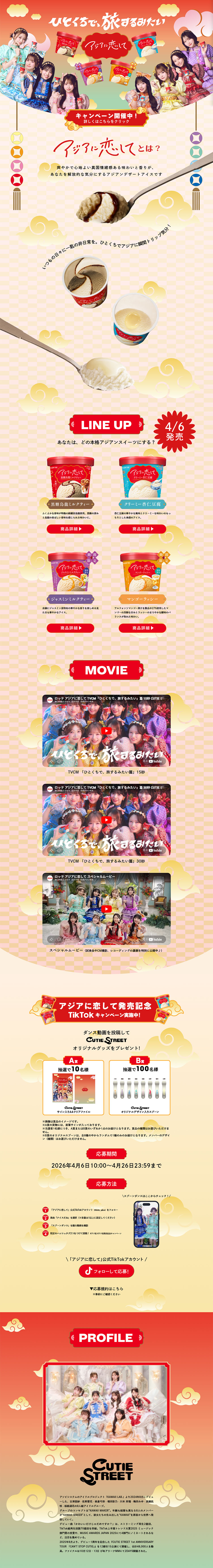
- Ajia ni Koishite
- Categories
- ice
- Company name
- LOTTE(Tokyo-to Shinjuku-ku)
- Color
- We design smartphone LPs using Orange tones
- Image
- These smartphone LPs have a "Lively type" style design
- Catchcopy
- Like taking a trip in a single bite.
- Site Description
- Overall, the site consistently presents a glamorous and pop worldview, resulting in a highly entertaining design that makes you feel happy just by looking at it. The layout centers on the idols and product visuals, maximizing visual appeal while clearly conveying the brand's brightness and approachability. The initial visuals communicate liveliness, giving a strong impression that the target audience will intuitively feel "fun" and "cute". In terms of structure, the flow—product introductions, video content, campaign information, and profiles—is simply organized, enabling users to follow information without getting lost. In particular, clear sectioning such as "LINEUP" and "MOVIE" is excellent because the purpose of each section is intuitively understood. Also, because pathways linking videos and social media are well integrated, the structure encourages further actions rather than mere browsing. Overall, this is a visually driven LP that nevertheless has well-organized information, achieving a balance between entertainment and functionality. The design effectively conveys the brand's fun and sense of specialness while naturally engaging users, and it appears to be very well matched to the target audience. The LP is already highly polished, and by maintaining this worldview while refining minor user flows, it could become even more effective.
- Design
- The color scheme is unified with warm tones based on red, orange, and gold, effectively conveying a sense of glamour and celebration. The clouds and ornaments used in the background add to this, giving the design a slightly Japanese-style flavor, which is a distinctive characteristic. Also, because the product's packaging colors are directly reflected in the design, there is a visual unity that helps build brand recognition. Overall, the contrasts are strong yet do not break the sense of cohesion, which leaves a positive impression.
【Note】 The landing page shown above was not designed by our company.
※You can view our production portfoliohere.
Clicking the design opens the source website.
*The original site may have been modified or removed.

