
LP design by Tsuruya Shokuhin Kabushikigaisha
View PC page
View SP page
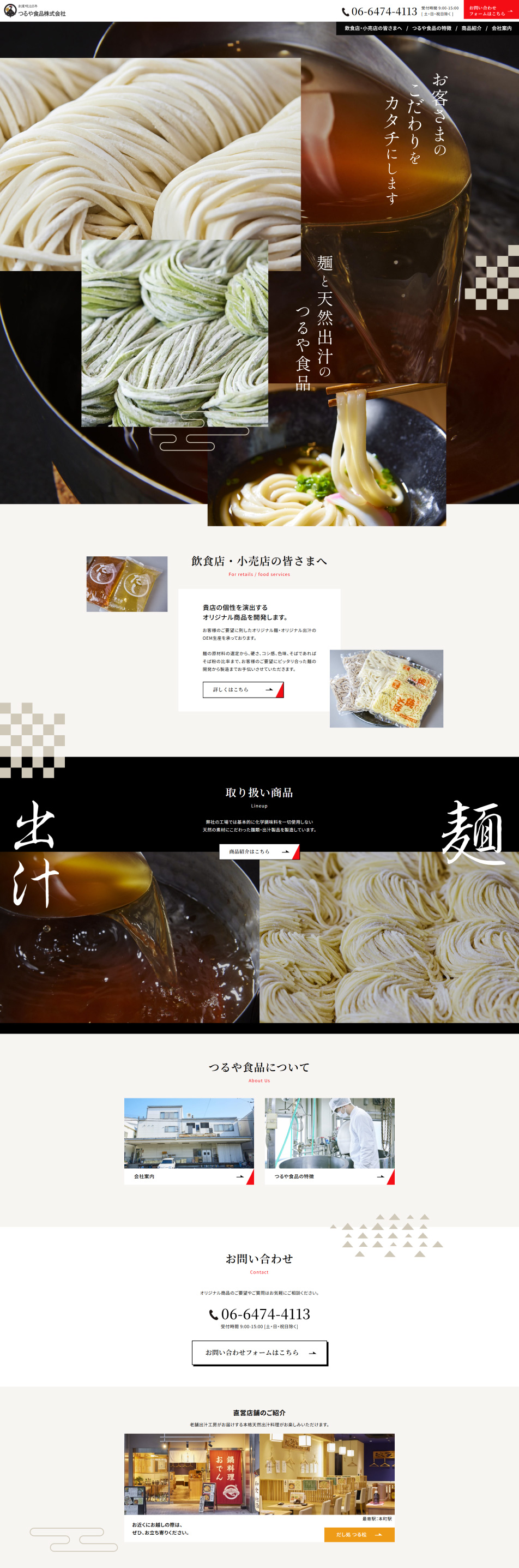

LP design by Tsuruya Shokuhin KabushikigaishaLP information
- Registration date 2026-03-19
- https://tsuruya-foods.co.jp/
- Product/service name
- Tsuruya Shokuhin Kabushikigaisha
- Categories
- Businesses, companies, stores
- Company name
- Tsuruya Shokuhin Kabushikigaisha(Osaka-fu)
- Color
- We design LPs using Beige tones
- Image
- These LPs have a "Japanese style" style design
- Catchcopy
- We shape our customers' preferences into reality - noodles and natural dashi from Tsuruya Shokuhin
- Site Description
- Tsuruya Shokuhin corporate page
- Design
- The calm design that evokes a sense of traditional Japanese aesthetics is striking, resulting in a landing page that carefully communicates product quality and attention to detail. In the hero section, mouthwatering visuals of noodles and dashi stimulate appetite and intuitively convey the appeal of the ingredients. A layout that takes advantage of white space and Japanese-style decorative touches creates an elegant atmosphere and enhances the brand's credibility. The information structure is simple and easy to understand, producing a highly refined design with a well-balanced relationship between visuals and content.
【Note】 The landing page shown above was not designed by our company.
※You can view our production portfoliohere.
Clicking the design opens the source website.
*The original site may have been modified or removed.











