
LP design by Riaru Dasshutsu Geemu 'Kuuhaku no Sotsugyoshiki to, Saigo no Uso.'
View PC page
View SP page

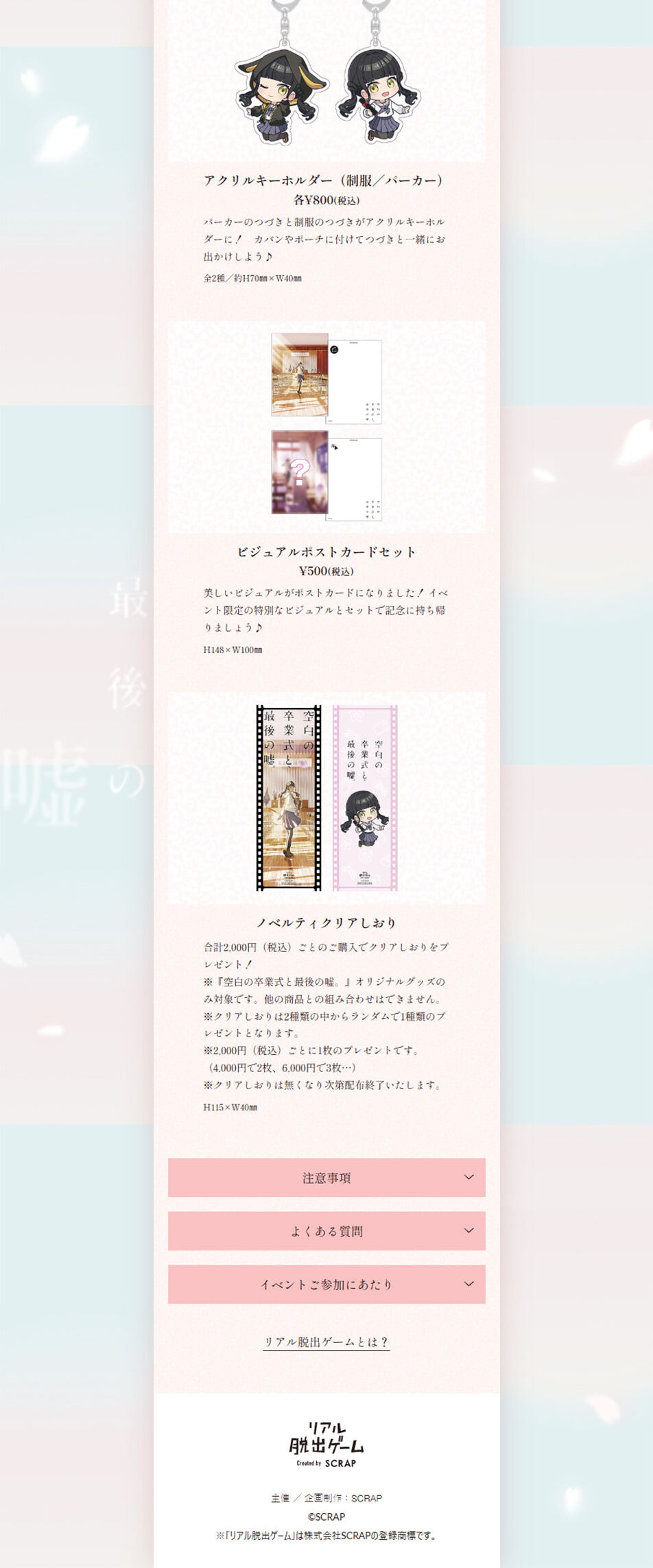


LP design by Riaru Dasshutsu Geemu 'Kuuhaku no Sotsugyoshiki to, Saigo no Uso.'LP information
- Registration date 2026-02-20
- https://realdgame.jp/s/sotsugyou/
- Product/service name
- Riaru Dasshutsu Geemu 'Kuuhaku no Sotsugyoshiki to, Saigo no Uso.'
- Categories
- Events, Campaigns, Experiences
- Company name
- Kabushiki Kaisha SCRAP(Tokyo-to Shibuya-ku)
- Color
- We design LPs using Pink shades
- Image
- These LPs have a "Cute style" style design
- Catchcopy
- You might die right here like this. You, too.
- Design
- It features a design with a calm, refined tone that emphasizes a wa (Japanese) aesthetic throughout. The overall palette is unified with soft hues such as off-white, pale beige, and muted pink, and the background is adorned with textures resembling washi paper and cherry blossom motifs. Ample whitespace, vertical text elements, and brush-stroke-style headings are used to express the subtle elegance and dignity characteristic of Japanese culture.
In the first view, a large visual of a person in kimono is placed prominently, creating a composition that evokes tradition and narrative. Flashy decorations are avoided; instead the layout leverages the beauty of the photographs themselves, drawing the viewer naturally into the brand's world. Information unfolds as if reading a story while scrolling, and emotionally resonant copy is placed with care.
In product and service description sections, information is separated with pale-colored boxes and lines to maintain readability while preserving the overall tone. Illustrations and kamon-style accents are used sparingly, achieving a balanced fusion of tradition and modernity.
Overall, the structure prioritizes "emotion", "trustworthiness", and "aesthetic sense" over liveliness, making it an LP design that speaks to the target audience in a thoughtful manner.
【Note】 The landing page shown above was not designed by our company.
※You can view our production portfoliohere.
Clicking the design opens the source website.
*The original site may have been modified or removed.











