
LP design by Riaru Dasshutsu Gemu 'Kuuhaku no Sotsugyoushiki to, Saigo no Uso.'
View PC page
View SP page

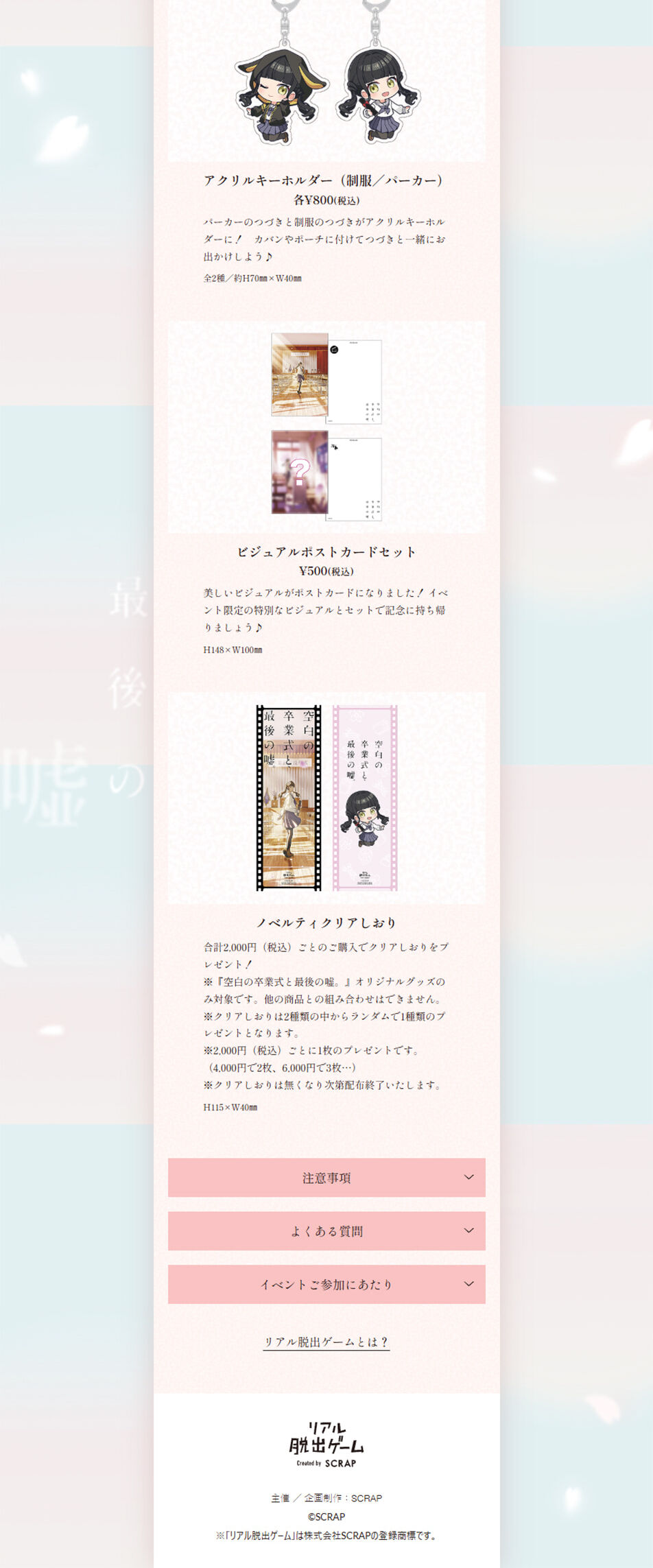


LP design by Riaru Dasshutsu Gemu 'Kuuhaku no Sotsugyoushiki to, Saigo no Uso.'LP information
- Registration date 2026-02-20
- https://realdgame.jp/s/sotsugyou/
- Product/service name
- Riaru Dasshutsu Gemu 'Kuuhaku no Sotsugyoushiki to, Saigo no Uso.'
- Categories
- Events, Campaigns, Experiences
- Company name
- Kabushiki-gaisha SCRAP(Tokyo-to Shibuya-ku)
- Color
- We design LPs using Pink shades
- Image
- These LPs have a "Cute style" style design
- Catchcopy
- You might die right here like this. You might, too.
- Design
- The design is characterized by a quiet, elegant tone that brings a Japanese aesthetic to the forefront. The overall palette is unified with soft hues such as ecru, pale beige, and muted pink, and the background features textures reminiscent of washi paper and cherry blossom motifs. Generous white space, vertical-writing elements, and brush-style headlines express a refined modesty and dignity typical of Japanese culture.
In the first view, a large visual of a kimono-clad subject is placed to evoke tradition and narrative. Flashy decorations are avoided in favor of a layout that lets the inherent beauty of the photographs shine, naturally drawing visitors into the brand's world. Information unfolds along the scroll like a story, with emotionally resonant copy carefully positioned.
In product introduction and service-description sections, information is separated using pale-colored boxes and lines to maintain readability without disrupting the overall tone. Illustrations and family-crest-style embellishments are used sparingly, balancing tradition and modernity.
Overall, the composition prioritizes "emotion," "trustworthiness," and "aesthetic sensibility" over liveliness, resulting in an LP design that speaks to the target audience in a careful, attentive manner.
【Note】 The landing page shown above was not designed by our company.
※You can view our production portfoliohere.
Clicking the design opens the source website.
*The original site may have been modified or removed.











