LP design by IRIS Corporation
View PC page
View SP page

LP design by IRIS CorporationLP information
- Registration date 2025-12-25
- https://www.iris.inc/
- Product/service name
- IRIS Corporation
- Categories
- Businesses, companies, stores
- Company name
- IRIS Corporation(Minato-ku, Tokyo)
- Color
- We design smartphone LPs using Shades of grey
- Image
- These smartphone LPs have a "Simple" style design
- Catchcopy
- Mobility to "New Experience". Transforming mobility into new experiences.
- Site Description
- IRIS is a PRIMEMEDIACOMPANY that creates new touchpoints in people's lives through mobility x media.
- Design
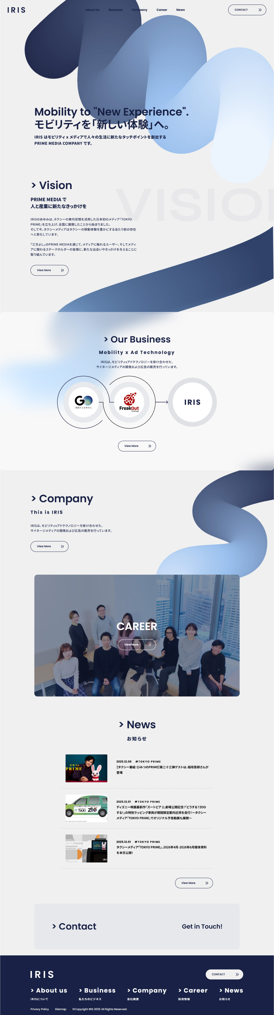
- Overall, this corporate LP design is highly sophisticated, effectively conveying a strong sense of innovation and brand philosophy. Abstract and fluid visual motifs intuitively express concepts like "Mobility" and "New Experience," leaving a strong impression of the company's stance and worldview. The bold use of negative space in the layout, combined with a calming blue-based color scheme, is also appealing, balancing sophisticated intellect with a sense of trust. The information density and user flow in each section are well-organized, ensuring natural eye movement and easy readability, allowing for a consistent understanding of the business content, vision, and recruitment information. I find it to be an exceptionally well-executed LP for corporate branding.
【Note】 The landing page shown above was not designed by our company.
※You can view our production portfoliohere.
Clicking the design opens the source website.
*The original site may have been modified or removed.