
LP design by Charton1month
View SP page

LP design by Charton1monthLP information
- Registration date 2025-11-04
- https://www.queen-eyes.com/c/charton/charton1month/sp=1
- Product/service name
- Charton1month
- Categories
- Cosmetics, makeup, and contact lenses
- Company name
- Ace Co., Ltd.(Minato-ku, Tokyo)
- Color
- We design smartphone LPs using Shades of grey
- Image
- These smartphone LPs have a "Cute style" style design
- Catchcopy
- You can become the cutest you've ever been.
- Design
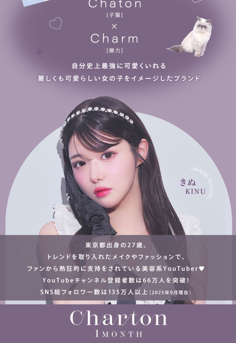
- Overall, I feel this is a highly polished LP design, where both the brand's worldview and information are well-balanced and organized. The top model visual instantly creates the desired atmosphere, and subsequently, a block structure with different background colors for each shade allows for an intuitive understanding of the series differences. By presenting the model's full face photo and a close-up of the eyes together, the lens color and size can be easily visualized, while functional information is visually organized in the lower section with a spec table and icons. The consistent pink-to-purple color scheme and girly typography strongly convey the brand's worldview, and the design naturally guides the user through a psychological flow of "I think it's cute" → "Compare colors" → "Choose with confidence" within the vertical scroll.
【Note】 The landing page shown above was not designed by our company.
※You can view our production portfoliohere.
Clicking the design opens the source website.
*The original site may have been modified or removed.











