Ultimate x Luxurious Onigiri(corporate)
View PC page
View SP page


Ultimate x Luxurious Onigiri(corporate)LP information
- Registration date 2024-12-05
- https://www.family.co.jp/campaign/spot/2412_omusubi_cp_ue6j8.html?sp=1
- Product/service name
- Ultimate x Luxurious Onigiri
- Categories
- Events, Campaigns, Experiences
- Company name
- FamilyMart()
- Color
- We design smartphone LPs using Green tones
- Image
- These smartphone LPs have a "Lively type" style design
- Catchcopy
- Site Description
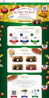
- The "Saikyo Donbei Musubi," a collaboration with "Nissin no Saikyo Donbei," and the "Gochi Musubi" series featuring luxurious ingredients have been released!
- Design
- This is a neutral opinion regarding the "Saikyo x Zeitaku Onigiri" campaign LP design by FamilyMart.
This LP features a design that effectively conveys the campaign's special and high-quality appeal. The overall color scheme, based on green and red, emphasizes a traditional Japanese atmosphere while creating a strong visual impact. Additionally, the Ichimatsu pattern and Japanese-style motifs in the background highlight the "Japanese" image of the product. Furthermore, by using gold as an accent color, the product's luxuriousness and exclusivity are accentuated.
The structure unfolds progressively, covering product introduction, campaign information, benefits, and related videos, making it easy for users to grasp the information smoothly. At the beginning, a large visual of the product is prominently placed, designed to convey its features and theme at a glance. In particular, the clear images of the product's packaging and contents visually appeal to its actual deliciousness and quality.
In the product details section, the price and features of individual products are concisely described, structured to allow visitors to easily compare and consider them. In particular, the product's "unique selling points" are summarized briefly, giving them strong appeal. Furthermore, campaign benefits and promotional information are clearly organized, creating a system that makes it easy for users to participate.
The utilization of the video section is highly effective in dynamically conveying the product's appeal. It conveys the charm of the cooking process and the actual product, with efforts made to keep viewers visually engaged.
On the other hand, there are parts where the overall amount of information is somewhat large, giving a visually cluttered impression. Especially in the campaign details section and product list, increasing whitespace and clearly separating each item could potentially improve readability. Also, the CTA (Call to Action) buttons have a subdued design, and making them slightly more prominent might improve click-through rates.
Overall, the product's sense of luxury and opulence is effectively expressed throughout the entire design. It has a clear appeal to the target audience and can be considered a highly complete LP for conveying the campaign's appeal. By adjusting visibility and CTA buttons, usability could be further improved, and purchasing intent enhanced.
【Note】 The landing page shown above was not designed by our company.
※You can view our production portfoliohere.
Clicking the design opens the source website.
*The original site may have been modified or removed.


