JoJo no Kimyō na Bōken Last Survivor(corporate)
View PC page
View SP page
JoJo no Kimyō na Bōken Last Survivor(corporate)LP information
- Registration date 2024-07-25
- https://bandainamco-am.co.jp/am/vg/jojols/?sp=1
- Product/service name
- JoJo no Kimyō na Bōken Last Survivor
- Categories
- Anime
- Company name
- Bandai Namco()
- Color
- We design smartphone LPs using Purples
- Image
- These smartphone LPs have a "Manga" style design
- Catchcopy
- Site Description
- Official Website for the arcade game "JoJo no Kimyō na Bōken Last Survivor"
- Design
- I will provide a neutral opinion on the design of this landing page.
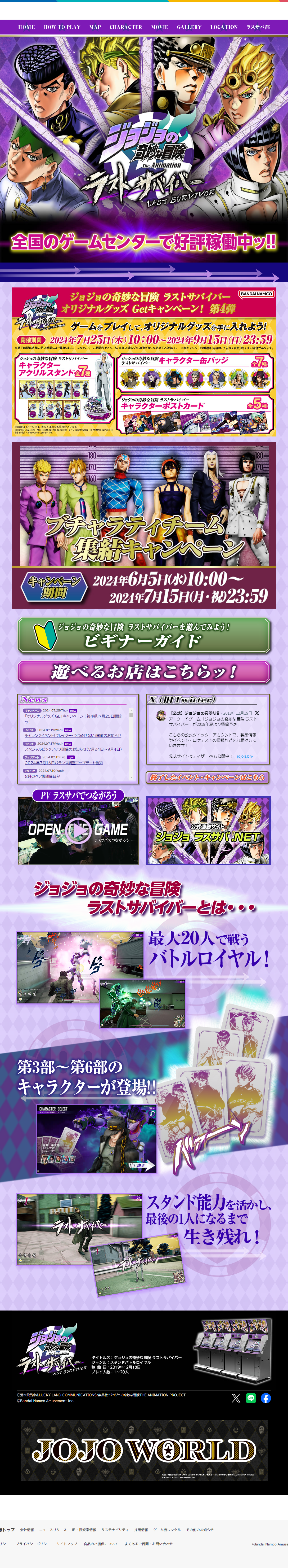
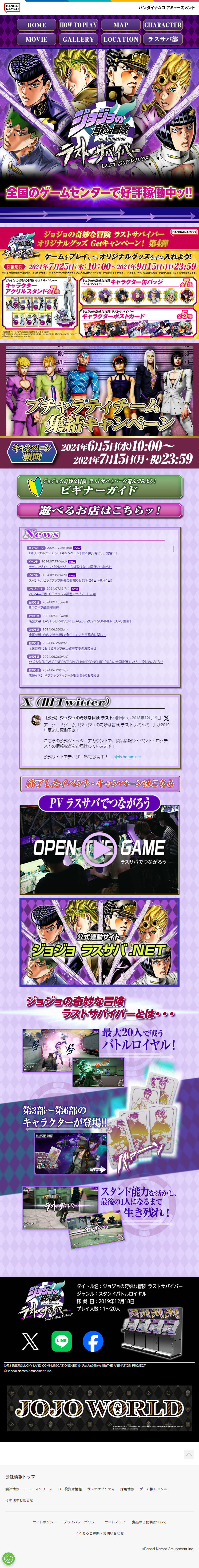
This landing page aims to promote the arcade game "Jojo no Kimyo na Boken Last Survivor" and features a very dynamic and colorful design.
It is characterized by flashy color schemes and powerful visuals, capable of delivering a strong impact and excitement to visitors.
Regarding color usage, a palette primarily based on purple and pink is employed, visually representing the unique world view of Jojo no Kimyo na Boken.
These colors symbolize mystery and energy, matching the game's theme.
Furthermore, titles and important information in each section are arranged to be emphasized, making them visually easy to understand.
As for the structure, information is organized, and efforts have been made to allow visitors to quickly access necessary information.
At the top, the main visual and catchphrase are prominently displayed, followed by game introductions and campaign information.
Each section is clearly separated, and information is provided without excess or deficiency.
In particular, sections like "Beginner Guide" and "Where to Play!" are visually well-arranged, and content that easily captures visitors' interest is effectively presented.
Furthermore, game play videos and screenshots are placed in the middle of the page, designed to visually attract visitors' interest.
Additionally, there are character introduction and news sections, allowing visitors to easily obtain detailed information.
In summary, this landing page is characterized by its dynamic and colorful design, capable of delivering a strong impact and excitement to visitors.
The color usage and layout are visually well-ordered, and it is designed for quick access to necessary information.
In particular, the extensive game play videos and character introductions serve as a very useful source of information for visitors.
It can be said that this page effectively conveys the appeal of the game to visitors.
【Note】 The landing page shown above was not designed by our company.
※You can view our production portfoliohere.
Clicking the design opens the source website.
*The original site may have been modified or removed.

