NewDays App(corporate)
View PC page
View SP page


NewDays App(corporate)LP information
- Registration date 2024-07-24
- https://retail.jr-cross.co.jp/newdays/app/#412?sp=1
- Product/service name
- NewDays App
- Categories
- Events, Campaigns, Experiences
- Company name
- NewDays()
- Color
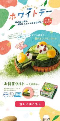
- We design smartphone LPs using yellow
- Image
- These smartphone LPs have a "Simple" style design
- Catchcopy
- Site Description
- Download the app to make your shopping at NewDays even more rewarding! There are plenty of great benefits to be had by registering as an email member or linking your Suica and PASMO information!
- Design
- I will provide a neutral opinion on the design of this landing page.
This landing page is designed to promote the NewDays app and features a very pop and bright design. It is characterized by an overall color scheme based on yellow and green, giving visitors an energetic and lively impression.
Regarding the color scheme, yellow and green are used as main colors, visually creating a very bright and cheerful atmosphere. Yellow symbolizes cheerfulness and happiness, while green represents security and trust. This is expected to give visitors a positive impression and encourage app usage. Additionally, character illustrations add to its approachability, emphasizing a friendly impression for users.
In terms of structure, information is organized to allow visitors easy access to necessary details. A prominent app download link is placed at the top for immediate downloads. Below it, the app's main features and benefits are introduced with illustrations, making them visually easy to understand. Specifically, detailed step-by-step explanations for member registration and Suica/PASMO registration are provided, ensuring users can proceed with the registration process without confusion.
Furthermore, a link to an AI chatbot is placed at the bottom of the page, providing a support system for users to resolve questions and doubts. This will enhance the user experience and lead to increased app usage.
In summary, this landing page is characterized by its pop and bright design, capable of giving visitors an energetic and lively impression. The color scheme and layout are visually organized, and it is designed to allow quick access to necessary information. Particularly, the clear explanation of member registration and Suica/PASMO registration methods serves as a very helpful resource for users. It can be said that this page promotes app usage to visitors and leaves a positive impression.
【Note】 The landing page shown above was not designed by our company.
※You can view our production portfoliohere.
Clicking the design opens the source website.
*The original site may have been modified or removed.


