Honey Nut Oolong Milk Tea(corporate)
View SP page

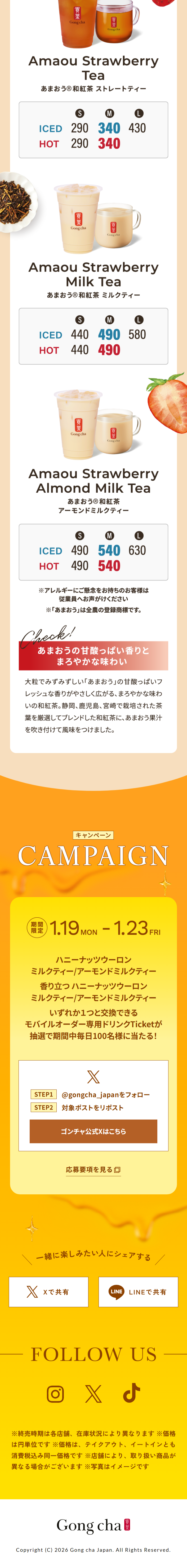
Honey Nut Oolong Milk Tea(corporate)LP information
- Registration date 2026-01-26
- https://campaign.gongcha.co.jp/honey-nuts-oolong-2026/index.html?_gl=1*35v0fw*_gcl_au*MzA3NjUwNDE2LjE3NjY0ODA0MzE.*_ga*OTQ1NzE2Nzk3LjE3NTY4OTAwNzQ.*_ga_F4SYD729GY*czE3Njk0MDIwOTQkbzkkZzEkdDE3Njk0MDIxMDYkajQ4JGwwJGgw&_ga=2.107302850.1548160272.1769402094-94
- Product/service name
- Honey Nut Oolong Milk Tea
- Categories
- Green Tea, Black Tea, and Coffee
- Company name
- Gong Cha Japan Co., Ltd.(Minato-ku, Tokyo)
- Color
- We design smartphone LPs using yellow
- Image
- These smartphone LPs have a "Cute style" style design
- Catchcopy
- Feel free to indulge? With honey, nuts, and oolong
- Design
- Overall, a consistent bright and friendly tone intuitively conveys the brand's worldview, making it an effective LP. The orange-themed color scheme strongly evokes a sense of season and deliciousness, and the highly appetizing photos effectively capture attention. Although there is a lot of information, it is well-organized into sections, making it easy to follow the flow and naturally progress from product appeal to campaign details. Overall, it's a well-designed LP that combines enjoyment and reassurance, and I believe it's a highly polished page that leaves a positive impression on the target audience.
【Note】 The landing page shown above was not designed by our company.
※You can view our production portfoliohere.
Clicking the design opens the source website.
*The original site may have been modified or removed.

