Your Personalized Snack Box(corporate)
View SP page


Your Personalized Snack Box(corporate)LP information
- Registration date 2024-10-02
- https://cp4.snaq.me/
- Product/service name
- SnackMe
- Categories
- Snack foods, gum, and candy
- Company name
- SnackMe Co., Ltd.(Chuo-ku, Tokyo)
- Color
- We design smartphone LPs using Orange tones
- Image
- These smartphone LPs have a "Cute style" style design
- Catchcopy
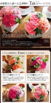
- Enjoy Guilt-Free! Your Personalized Snack Box
- Design
- The color scheme is unified overall, with the contrast between orange and blue being particularly effective. Orange, symbolizing vibrancy and energy, is used to draw attention, while blue represents calmness and trustworthiness, providing a sense of security to users. This combination makes the entire page visually organized and enhances readability. Furthermore, by subtly changing the background color in each section, information is naturally segmented, and the viewer's gaze is guided smoothly.
【Note】 The landing page shown above was not designed by our company.
※You can view our production portfoliohere.
Clicking the design opens the source website.
*The original site may have been modified or removed.

