
LP design by Kabushiki Gaisha Nichibou Recruitment
View PC page
View SP page

LP design by Kabushiki Gaisha Nichibou RecruitmentLP information
- Registration date 2026-09-30
- https://recruit.nitibou.co.jp/
- Product/service name
- Kabushiki Gaisha Nichibou Recruitment
- Categories
- Businesses, companies, stores
- Company name
- Kabushiki Gaisha Nichibou()
- Color
- We design smartphone LPs using Shades of blue
- Image
- These smartphone LPs have a "Simple" style design
- Catchcopy
- Creating the future.
- Design
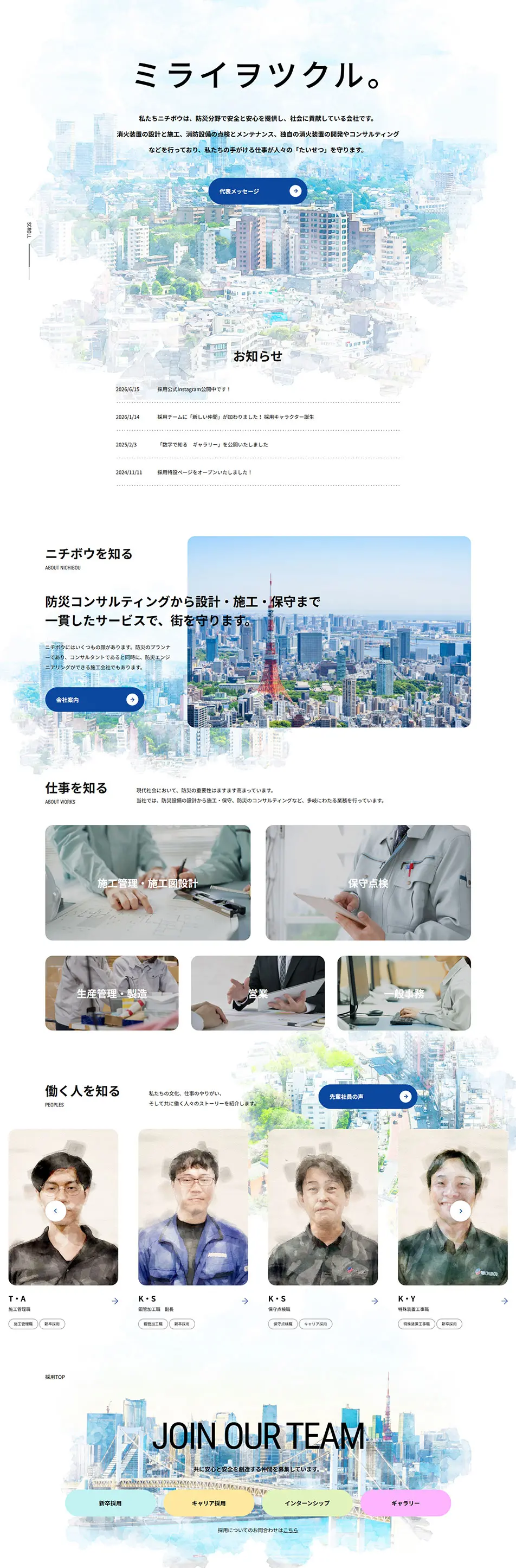
- This recruitment site is designed to carefully convey the company's philosophy of supporting cities and everyday life through disaster-prevention equipment, as well as the appeal of the people who work there.
Throughout, the site uses a predominantly white palette, incorporating pale watercolor-style urban scenes and soft photographic expressions to create a world that, despite the industry's technical nature, conveys warmth and human connection.
In the first view (hero section), a prominently placed message against a cityscape background powerfully communicates the company's mission and intuitively conveys its values and direction to job seekers.
A simple layout and use of whitespace make each piece of information stand out and create a natural flow that leads to a deeper understanding of the company.
The section introducing job roles presents positions such as design, construction, and maintenance in photo-backed card formats, allowing visitors to visually grasp specific job responsibilities.
Not only does it introduce tasks, but by featuring the appearances and voices of actual employees, the design also conveys workplace atmosphere and the personal appeal that lies beyond the job description.
In the employee profiles, portraits are processed with a watercolor-like effect to create friendly visuals that communicate individuality and personality. Focusing on each employee enables visitors to sense the company culture and working environment that are hard to convey through corporate information alone.
Also, the path to the recruitment page features a prominently placed "JOINOURTEAM" message and clearly organizes entry points such as new graduate hiring, mid-career hiring, and internships. It balances the company's credibility with the approachable feel unique to recruitment sites, making it easy for job seekers to imagine their future working life.
【Note】 The landing page shown above was not designed by our company.
※You can view our production portfoliohere.
Clicking the design opens the source website.
*The original site may have been modified or removed.











