
LP design by Original recruitment site production made with WordPress
View PC page
View SP page


LP design by Original recruitment site production made with WordPressLP information
- Registration date 2026-09-30
- https://mtrad.co.jp/lp/saiyo-lp/
- Product/service name
- Original recruitment site production made with WordPress
- Categories
- Design, Apps, Systems
- Company name
- Kabushiki Kaisha Emutoraddo()
- Color
- We design smartphone LPs using Orange tones
- Image
- These smartphone LPs have a "Simple" style design
- Catchcopy
- Stand out with your recruitment site. Become the employer of choice.
- Design
- This landing page is designed to convey the appeal of a recruitment site production service by combining a clean feel with approachability. It uses a pale green as the base color throughout, with orange accents to create a sense of security and trust while also giving a positive, energetic impression. The hero section prominently displays portfolio examples and recruitment page imagery, using a layout that intuitively communicates the service's features so visitors can understand the content quickly.
Within the page, a spacious layout with generous whitespace and frequent use of rounded-card designs creates a soft, contemporary atmosphere. The benefits section, which effectively incorporates icons and illustrations, visually organizes information-heavy content to create an easy-to-follow reading flow.
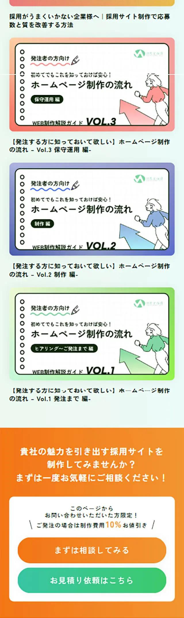
In the sections for case studies and the production flow, actual deliverables are displayed prominently to increase the concreteness of the service content. It is also characterized by a design that balances images and text so information is absorbed naturally following the viewer's eye movement. Additionally, orange is used in the CTA areas to clarify action points and encourage action, giving them presence while maintaining harmony with the page's overall color scheme.
Overall, this landing page is finished as a design that conveys the service's expertise in recruitment while also evoking a warmth that connects companies and job seekers. It is a reference-worthy design for service-introduction landing pages that combines information organization, readability, and brand image expression in a well-balanced way.
【Note】 The landing page shown above was not designed by our company.
※You can view our production portfoliohere.
Clicking the design opens the source website.
*The original site may have been modified or removed.











