
LP design by inzerii Furuutsu Shokkan
View PC page
View SP page
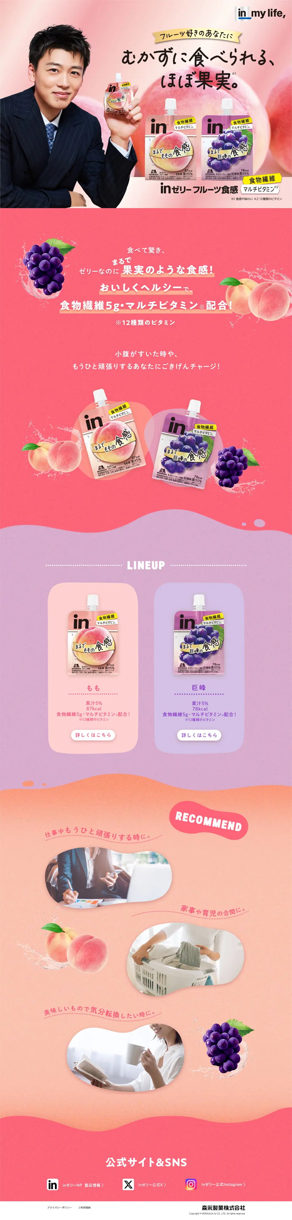

LP design by inzerii Furuutsu ShokkanLP information
- Registration date 2026-06-25
- https://www.morinaga.co.jp/in/fruit/2026new/
- Product/service name
- inzerii Furuutsu Shokkan
- Categories
- Beauty foods, beauty drinks, and supplements
- Company name
- Morinaga Seika Kabushiki Kaisha(Tokyo-to Minato-ku)
- Color
- We design LPs using Pink shades
- Image
- These LPs have a "Cute style" style design
- Catchcopy
- Can be eaten without chewing; almost like fruit.
- Design
- Main design features: expression of juicy "fruit-likeness". A large illustration of a peach in the center and the use of gradients immediately convey that it is "peach flavor". A water-drop-like effect is also applied, emphasizing juiciness and freshness. Differentiation from the conventional "inzerii": Unlike the traditional pouch design (a silver-based, sporty impression), the overall design uses pastel pink. This visually communicates the concept of not only energy supplementation but also "enjoying it like a dessert". Clear functional labeling: A gold band at the top neatly lists nutrients such as "5g dietary fiber" and "multivitamin", intuitively conveying that the product contains body-friendly ingredients. Elegant and approachable fonts: Combining the "Furuutsu Shokkan" text with a rounded handwritten-style font creates an unpretentious, approachable feel that makes it easy for women and young people to pick up.
【Note】 The landing page shown above was not designed by our company.
※You can view our production portfoliohere.
Clicking the design opens the source website.
*The original site may have been modified or removed.











