
LP design by Ooshima Tsubaki 100th Anniversary Site
View PC page
View SP page

LP design by Ooshima Tsubaki 100th Anniversary SiteLP information
- Registration date 2026-02-24
- https://www.oshimatsubaki.co.jp/100th/
- Product/service name
- Ooshima Tsubaki 100th Anniversary Site
- Categories
- Skincare, Bodycare, Haircare
- Company name
- Ooshima Tsubaki Kabushiki Kaisha(Tokyo-to Minato-ku)
- Color
- We design LPs using Beige tones
- Image
- These LPs have a "Refined style" style design
- Catchcopy
- Together with Tsubaki, from now on as well
- Site Description
- In 2027, Ooshima Tsubaki will celebrate its 100th anniversary.
- Design
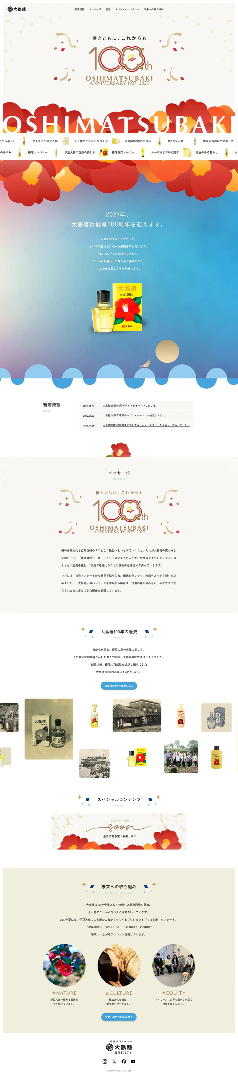
- Overall, the design feels like a place where dignity and festivity coexist beautifully; the weight of the milestone “100th anniversary” and a gentle look toward the future are expressed with care. Built on the trust unique to a long-established brand, it never becomes overly rigid but instead wears an air that is somewhat light and warm, which is very striking.
The hero/first view is particularly well executed: the camellia motif and the “100th” logo are placed symbolically, leaving a very strong visual and semantic impression. The red-and-gold color scheme evokes tradition and formality, while the treatment of petals and the use of white space maintain softness, achieving an exquisite balance between celebration and approachability.
As you scroll, gradient backgrounds and wave-like decorations appear, naturally evoking the “flow of time” and a “brand that continues into the future.” Far from being mere ornamentation, these elements visually reinforce a story that connects history to the future, which is very beautiful. The product placed at the center does not shout for attention but quietly holds presence as a brand emblem.
In the message and history sections, information is arranged with generous white space, giving readers a calm impression. Old photographs and product visuals are presented not as mere materials but as a sense of “accumulated time,” allowing viewers to naturally absorb the brand’s journey.
Also, in the sections introducing future-oriented initiatives such as “NATURE,” “CULTURE,” and “EQUITY,” round photos and soft color schemes gently present the brand’s future direction. While carrying the weight of the past, the site feels open to the future, making it a commemorative site that nevertheless conveys a forward-looking story.
Overall, this design quietly and elegantly expresses both the “long-standing value” and the “will to continue.” Rather than flashy effects, it communicates the brand’s dignity through the texture of details, the use of white space, and color choices, resulting in a maturely beautiful design fitting for the 100th anniversary.
【Note】 The landing page shown above was not designed by our company.
※You can view our production portfoliohere.
Clicking the design opens the source website.
*The original site may have been modified or removed.











