
LP design by Liberta Soccer School
View PC page
View SP page

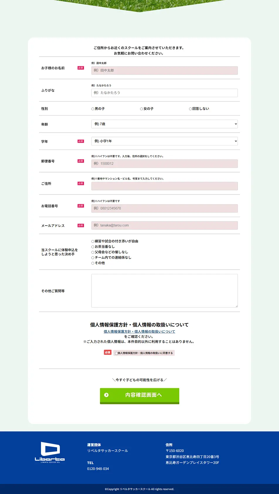



LP design by Liberta Soccer SchoolLP information
- Registration date 2026-01-21
- https://liberta.sport-school.com/plp2/
- Product/service name
- Liberta Soccer School
- Categories
- General Sports and Spectating
- Company name
- Liberta Soccer School(Shibuya-ku, Tokyo)
- Color
- We design LPs using yellow
- Image
- These LPs have a "Lively type" style design
- Catchcopy
- Chosen by over 20,000 parents
- Site Description
- The strong contrast of blue and yellow creates visibility and vibrancy, intuitively conveying the "clarity" and "reliability" of the service. Despite the extensive use of characters and illustrations, the information architecture is well-organized, allowing for a gradual understanding of numerical data, achievements, and mechanisms. Switching background colors for each section maintains a scrolling rhythm even in long formats, making it less tiring to read, which is also a positive impression. CTAs and important information are clearly emphasized with color and whitespace, providing a very clear path to action. Overall, it skillfully balances the sense of security and approachability required for educational and support services with a dynamic visual presentation.
Liberta Soccer SchoolLibertasoccersoccer schoolfootballsoccer classjunior soccerkids soccersoccer teamsoccer practicesoccer coachingsports schoolsoccer academyfootball schoolsoccer class operation
【Note】 The landing page shown above was not designed by our company.
※You can view our production portfoliohere.
Clicking the design opens the source website.
*The original site may have been modified or removed.











