
LP design by Calbee Potato Chips 50th Anniversary
View PC page
View SP page
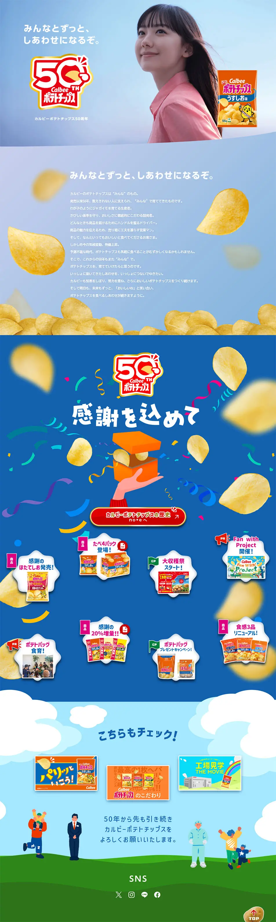

LP design by Calbee Potato Chips 50th AnniversaryLP information
- Registration date 2026-01-19
- https://www.calbee.co.jp/potatochips50th/?banner=pickup
- Product/service name
- Calbee Potato Chips 50th Anniversary
- Categories
- Snack foods, gum, and candy
- Company name
- Calbee(Chiyoda-ku, Tokyo)
- Color
- We design LPs using Shades of blue
- Image
- These LPs have a "Simple" style design
- Catchcopy
- We will continue to find happiness together with everyone.
- Design
- This design expresses a worldview that positively and brightly celebrates the milestone of the 50th anniversary, based on an expansive blue reminiscent of the sky. By prominently featuring photographs of people, it shortens the distance between the brand and consumers, and a gentle gaze towards the future enhances the message. The composition visually conveys a sense of celebration and fun through the depiction of potato chips dancing in the air, confetti, and curved accents. Furthermore, the logos and copy are arranged in a well-balanced manner to naturally guide the viewer's eye, and are organized to prevent the overall design from becoming too cluttered even with a large amount of information. Overall, this design simultaneously evokes a sense of security that has been loved for many years and hope for its continuation into the future.
【Note】 The landing page shown above was not designed by our company.
※You can view our production portfoliohere.
Clicking the design opens the source website.
*The original site may have been modified or removed.











