
LP design by Bee Vocal School
View PC page
View SP page


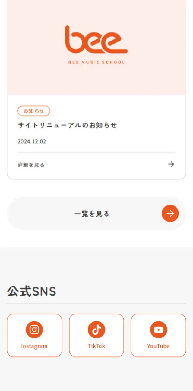
LP design by Bee Vocal SchoolLP information
- Registration date 2025-04-23
- https://www.bee-music.jp/vocal/
- Product/service name
- Bee Vocal School
- Categories
- school
- Company name
- Bee Factory Inc.(Toshima-ku, Tokyo)
- Color
- We design LPs using Orange tones
- Image
- These LPs have a "Simple" style design
- Catchcopy
- Life becomes colorful with "song".
- Site Description
- Bee Vocal School's lessons begin with understanding each student. By thoroughly understanding each student's "songs they want to sing" and "image of the voice they want to achieve," we provide customized lessons that maximize your potential.
- Design
- The LP design for "Bee Vocal School" is exceptionally well-structured, conveying both approachability and trustworthiness simultaneously. The overall warm color scheme, predominantly orange, evokes energy and passion, which perfectly suits the theme of music and vocal lessons. The balance with the white background is also exquisite, ensuring high visibility and neatly organized information.
In the hero section, individuals who appear to be actual students are featured, evoking feelings like "I could do this too" and "this looks fun." This successfully creates a strong first impression that intuitively draws interest.
What stands out is the excellent storytelling. The appeal of custom-made lessons, experienced instructors, abundant testimonials, and diverse student voices are meticulously presented both visually and verbally, strongly conveying the impression of a "trustworthy school." It's also wonderful that elements providing peace of mind, such as individuality, flexibility, and support systems for beginners, are richly incorporated.
Furthermore, the prominent display of photos showing the classroom atmosphere and facilities makes it easy to visualize the actual environment, effectively appealing to "accessibility" and "comfort" visually. The inclusion of event information and updated news also shows efforts to continuously attract interest.
Pricing information and the enrollment process are also simply and clearly organized, and CTA buttons are naturally placed, creating a well-structured user journey that doesn't confuse users about their next action.
Overall, it's an excellent LP that effectively conveys "fun," "accessibility," and "trustworthiness," while featuring a user-centric design and structure. It's evident that not only is the visual aesthetics beautiful, but the information architecture and user experience have also been meticulously designed. A truly appealing final product.
【Note】 The landing page shown above was not designed by our company.
※You can view our production portfoliohere.
Clicking the design opens the source website.
*The original site may have been modified or removed.











