
LP design by Diane Lotus
View PC page
View SP page
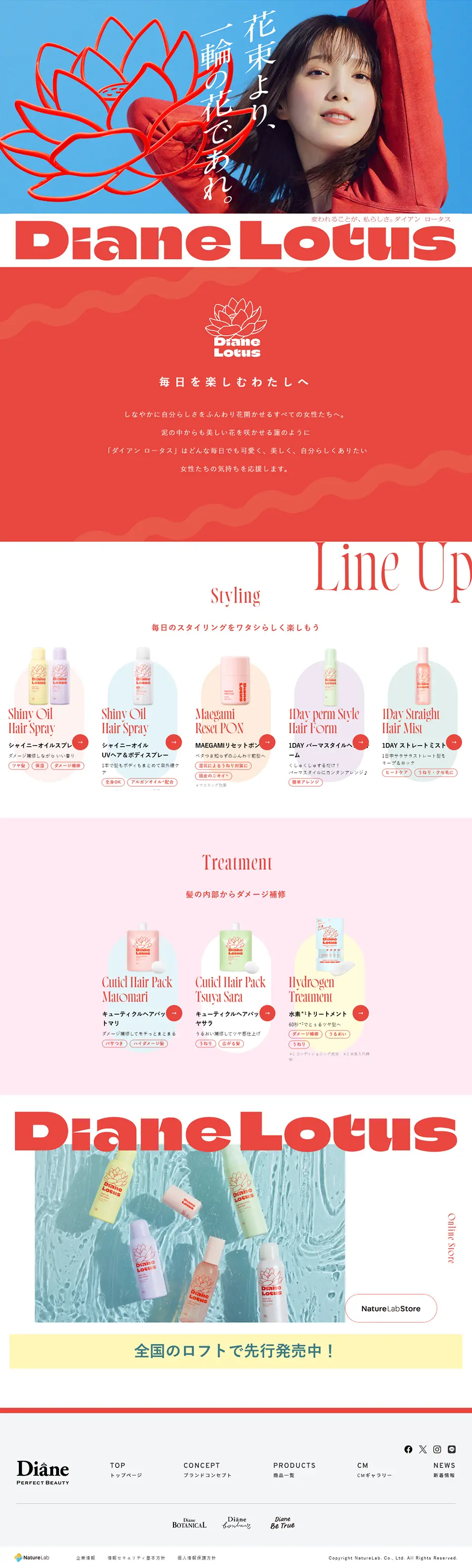

LP design by Diane LotusLP information
- Registration date 2025-04-02
- https://www.moist-diane.jp/products/lotus/
- Product/service name
- Diane Lotus
- Categories
- Skincare, Bodycare, Haircare
- Company name
- NatureLab Co., Ltd.(Shibuya-ku, Tokyo)
- Color
- We design LPs using Shades of blue
- Image
- These LPs have a "Refined style" style design
- Catchcopy
- Be a single flower rather than a bouquet.
- Site Description
- For me, who enjoys every day.
- Design
- This landing page features an excellent balance of worldview presentation, visibility, and usability, maximizing the brand's appeal.
① Visual Design
・The brand's worldview is effectively conveyed through vibrant colors and sophisticated font usage.
・The model's expressions and the lotus motif are impressive, creating an engaging first impression.
・The overall screen has brightness and unity, making for a visually pleasing design.
② Information Architecture and Content Structure
・Information, from brand concept to product lineup and purchase guide, is meticulously organized and arranged in a natural flow.
・Product introductions are categorized for easy viewing, intuitively conveying the appeal and characteristics of each.
・The content is simply summarized, which smoothly facilitates user understanding, leaving a positive impression.
③ User Experience (UX) and User Flow
・The design allows users to smoothly access desired information, indicating consideration for users.
・CTAs (purchase buttons and links) are highly visible, making it easy to guide users to a purchase action.
・The overall experience is designed for comfortable browsing, resulting in a positive UX that enhances the brand's image.
【Note】 The landing page shown above was not designed by our company.
※You can view our production portfoliohere.
Clicking the design opens the source website.
*The original site may have been modified or removed.











