
LP design by Nikusoba 20th Anniversary Campaign
View PC page
View SP page
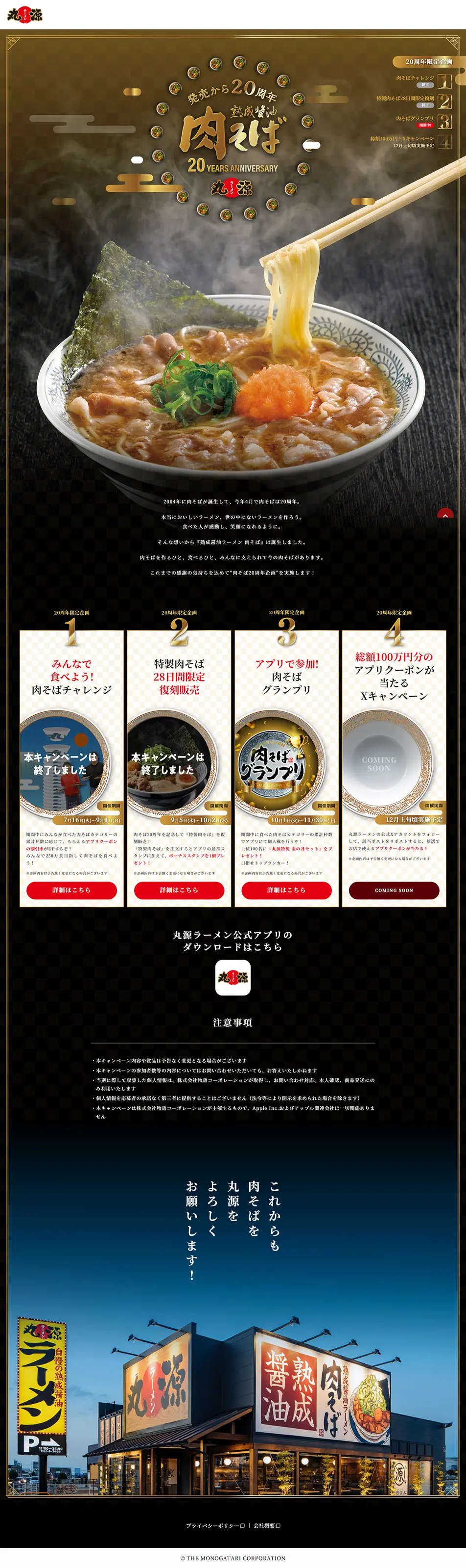

LP design by Nikusoba 20th Anniversary CampaignLP information
- Registration date 2024-10-24
- https://www.syodai-marugen.jp/lp/nikusoba20th/
- Product/service name
- Nikusoba 20th Anniversary Campaign
- Categories
- Events, Campaigns, Experiences
- Company name
- Monogatari Corporation(Toyohashi City, Aichi Prefecture)
- Color
- We design LPs using Gold tones
- Image
- These LPs have a "Japanese style" style design
- Catchcopy
- Aged Soy Sauce Nikusoba: 20 Years Since Its Launch
- Site Description
- Nikusoba was born in 2004, marking its 20th anniversary this April.
- Design
- This page skillfully blends a sense of luxury with traditional Japanese elements in its design, celebrating Marugen Ramen's Nikusoba 20th anniversary special event. It features an appealing balance of appetite-stimulating visuals and clear, concise information, structured to strongly convey the campaign's appeal to visitors.
Design Image
A large image of ramen is placed at the top of the page, realistically depicting steam rising, which creates a very appetizing impression. Golden decorations and text are used to evoke a sense of specialness and luxury befitting a 20th-anniversary celebration. Overall, a traditional Japanese atmosphere permeates, reflecting the brand's history and commitment to quality.
Design Color Scheme
The main colors used on the page are a combination of black, gold, and red. Black and gold emphasize luxury, while red is effectively positioned as an appetite-stimulating color. Golden circular designs and red buttons are specifically used to make information about campaigns and benefits visually prominent, leaving a strong impression on visitors. The use of gold and red on a black background is also designed to make important messages stand out.
Structure
The page's structure effectively and simply summarizes information related to the 20th-anniversary campaign. It begins with a visual impact, followed by campaign details and calls to action. Four campaigns are introduced sequentially, each with a "details" button, allowing visitors immediate access to necessary information. Additionally, an official app download link is prominently placed at the bottom, designed to promote user engagement.
【Note】 The landing page shown above was not designed by our company.
※You can view our production portfoliohere.
Clicking the design opens the source website.
*The original site may have been modified or removed.











