
LP design by Mandom challenges itself to be useful in space!
View PC page
View SP page
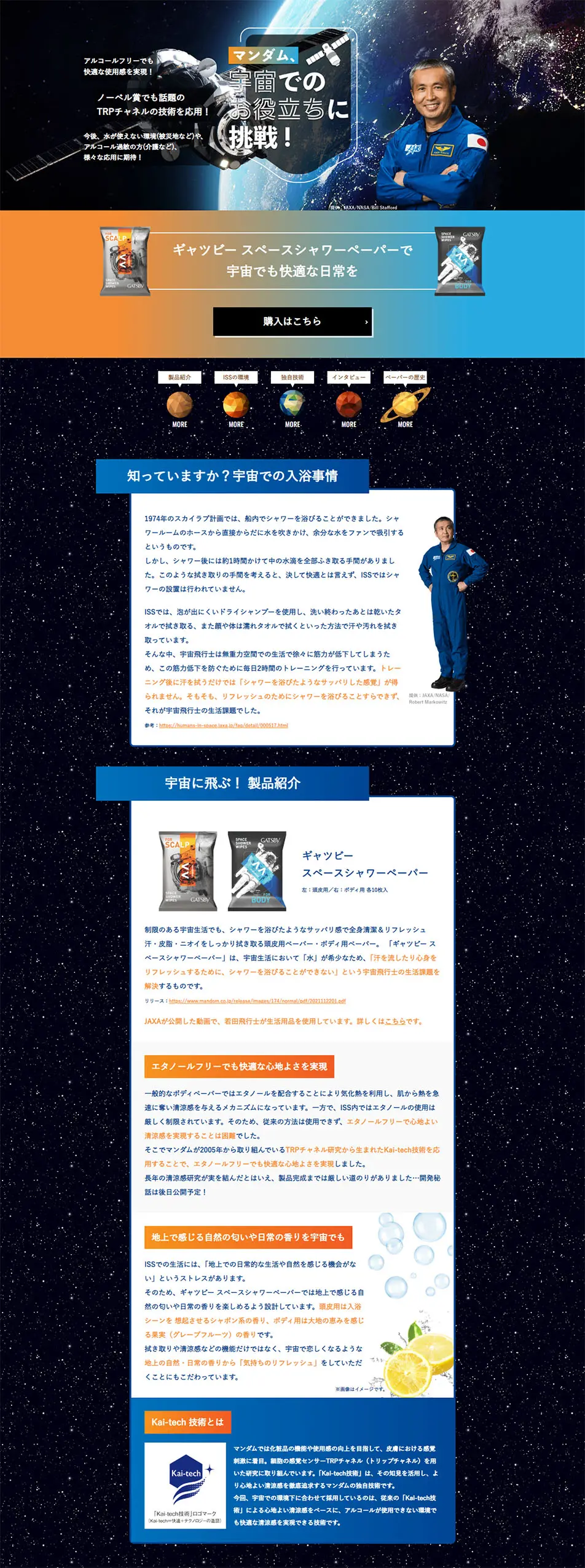

LP design by Mandom challenges itself to be useful in space!LP information
- Registration date 2024-09-12
- https://www.mandom.co.jp/special/contents08.html
- Product/service name
- Mandom challenges itself to be useful in space!
- Categories
- Businesses, companies, stores
- Company name
- Mandom(Osakashi Chuo-ku)
- Color
- We design LPs using Black-colored
- Image
- These LPs have a "Cool style" style design
- Catchcopy
- Mandom challenges itself to be useful in space!
- Site Description
- The design of the landing page features impactful visuals that leverage the theme of space. Spaceships and stars are arranged in the background, with black and dark blue, symbolizing outer space, used as the base. This emphasizes the uniqueness of products marketed for space use, creating a visually striking composition. Additionally, the appearance of actual astronauts in the main visual enhances the product's reliability and innovativeness.
- Design
- In terms of composition, it starts with a main visual that delivers a strong visual impact, followed by a gradual explanation of the product's functionality and convenience. The conditions of use in space and the technical background are explained, emphasizing that the product is based on scientific evidence. Furthermore, information is organized into sections, showcasing an effort to help users absorb information incrementally.
【Note】 The landing page shown above was not designed by our company.
※You can view our production portfoliohere.
Clicking the design opens the source website.
*The original site may have been modified or removed.











