
LP design by Kaiju No. 8 UT
View PC page
View SP page


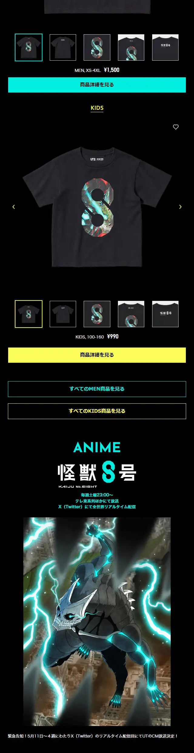
LP design by Kaiju No. 8 UTLP information
- Registration date 2024-06-06
- https://www.uniqlo.com/jp/ja/special-feature/ut/kaiju-no8
- Product/service name
- Kaiju No. 8 UT
- Categories
- Events, Campaigns, Experiences
- Company name
- Uniqlo(Minato Ward, Tokyo)
- Color
- We design LPs using Black-colored
- Image
- These LPs have a "Manga" style design
- Catchcopy
- A new-era anime T-shirt depicting a story set in Japan, the land of Kaiju.
- Site Description
- The LP's structure is clearly divided into sections, making it easy for users to follow the information. An impactful visual is placed at the top, followed by visually organized character introductions and product lineups. Each section is titled, designed to allow the content to be understood at a glance. Particularly in the "LINEUP" section, product details are organized in a list format, making it very easy to view.
- Design
- This LP design is very energetic, filled with visually appealing elements.
Characters and monsters are centrally positioned, and their powerful visuals capture the viewer's interest.
The overall tone exudes a dark and mysterious atmosphere, perfectly matching the content's theme.
About the color usage in the design
The color palette primarily emphasizes the contrast between black and cyan.
Black is utilized as the background, and cyan is applied to text and lines, thereby highlighting crucial information and sections.
Furthermore, yellow warning signs are employed as an accent color, effectively drawing visual attention.
Overall, the color scheme provides high visibility and clearly communicates the priority of information.
【Note】 The landing page shown above was not designed by our company.
※You can view our production portfoliohere.
Clicking the design opens the source website.
*The original site may have been modified or removed.











