
LP design by Kyushu Shinkansen Tsubame 20th Anniversary
View PC page
View SP page


LP design by Kyushu Shinkansen Tsubame 20th AnniversaryLP information
- Registration date 2024-03-14
- https://www.jrkyushu.co.jp/train/tsubamehatachi/
- Product/service name
- Kyushu Shinkansen Tsubame 20th Anniversary
- Categories
- Domestic and international travel
- Company name
- Kyushu Ryokaku Tetsudo Kabushiki Gaisha(3-25-21 Hakata Ekimae, Hakata Ward, Fukuoka City)
- Color
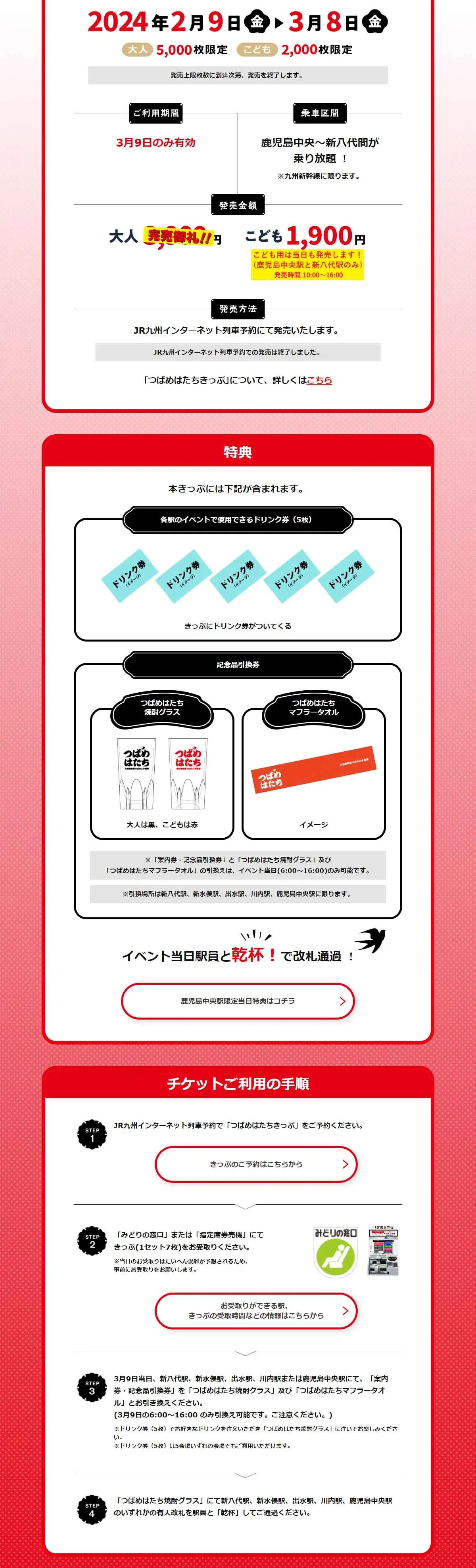
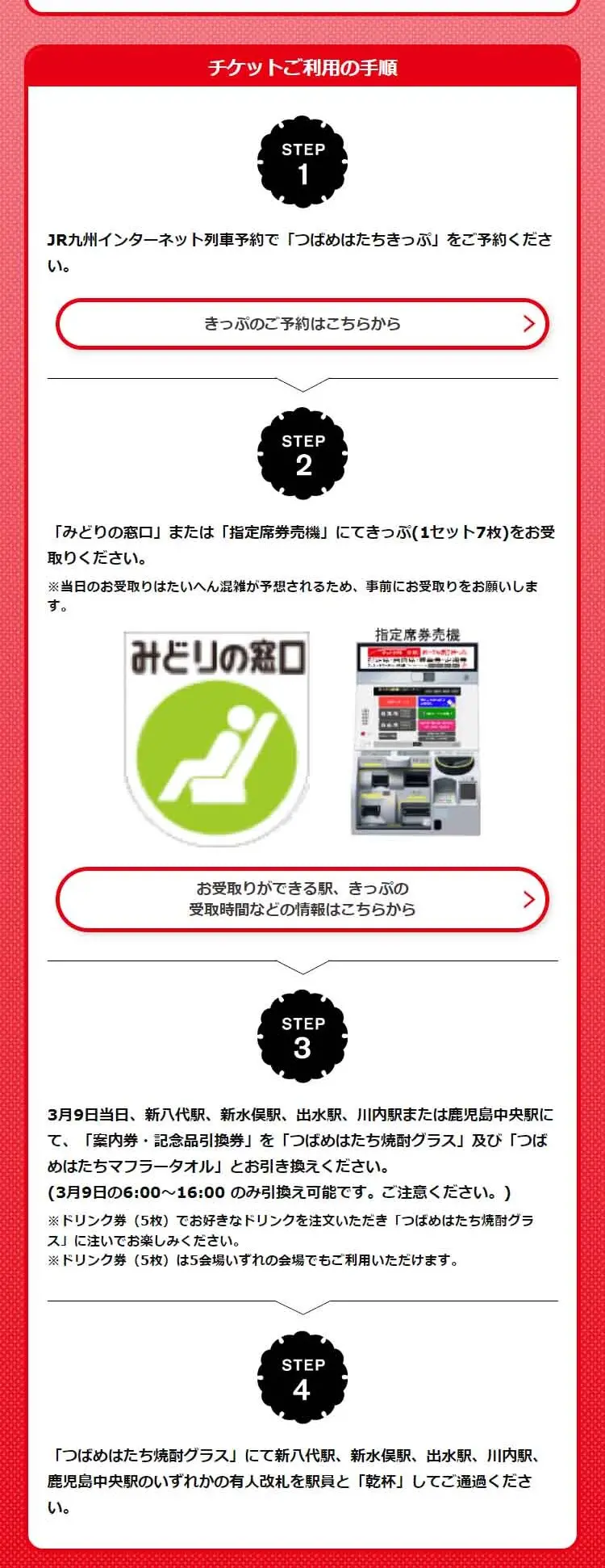
- We design LPs using Red tones
- Image
- These LPs have a "Japanese style" style design
- Catchcopy
- Let's all raise a toast together! Tsubame at 20, Kyushu Shinkansen Tsubame 20th Anniversary
- Site Description
- This is the official website page for the "Kyushu Shinkansen Tsubame 20th Anniversary".
- Design
- This landing page features a design primarily based on red and white, conveying a formal and trustworthy image. Red is known as a color that attracts attention and indicates urgency, while white symbolizes cleanliness and simplicity, making this color combination effective in prompting user action.
【Note】 The landing page shown above was not designed by our company.
※You can view our production portfoliohere.
Clicking the design opens the source website.
*The original site may have been modified or removed.











