
LP design by Triple Revolution Campaign
View PC page
View SP page
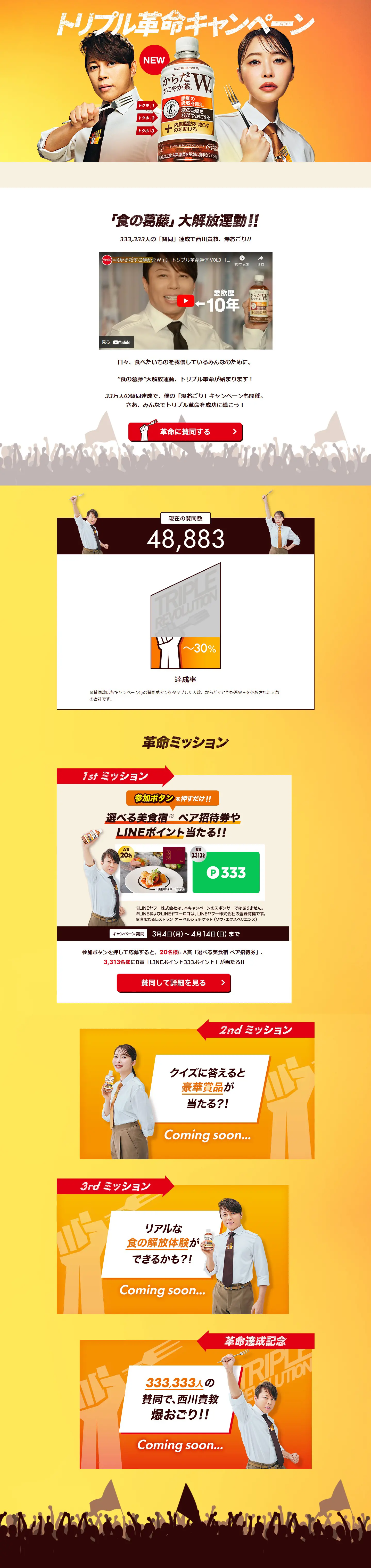

LP design by Triple Revolution CampaignLP information
- Registration date 2024-03-07
- https://c.cocacola.co.jp/sukoyakacha/triple_revolution/
- Product/service name
- Triple Revolution Campaign
- Categories
- Events, Campaigns, Experiences
- Company name
- Nihon Coca-Cola Corporation(Shibuya-ku, Tokyo)
- Color
- We design LPs using Orange tones
- Image
- These LPs have a "Stylish type" style design
- Catchcopy
- Triple Revolution Campaign
- Site Description
- The Triple Revolution Campaign is underway! Join the revolution!
- Design
- This landing page features a bright and energetic design, dynamically conveying the product's appeal and campaign information. The primary use of orange and yellow symbolizes vitality and positive energy, effectively attracting visitors' attention. Such vibrant colors can emphasize the product's active image and contribution to health, creating a positive impression on users.
Karada Sukoyaka Cha WKarada Sukoyaka Cha W PlusKarada Sukoyaka Cha DoubleKarada Sukoyaka Cha Double PlusKarada Sukoyaka ChaSukoyaka ChasukoyakachaFatSugarVisceral FatCommercialCoca-ColaCoca-ColaTokuhoTokuhoFood for Specified Health UsesNishikawa TakanoriSashihara RinoTriple RevolutionCampaignLINE PointsWin
【Note】 The landing page shown above was not designed by our company.
※You can view our production portfoliohere.
Clicking the design opens the source website.
*The original site may have been modified or removed.











