
LP design by The Rich Caramel
View PC page
View SP page

LP design by The Rich CaramelLP information
- Registration date 2024-01-29
- https://www.haagen-dazs.co.jp/products/special/rich-caramel/
- Product/service name
- The Rich Caramel
- Categories
- Western confectionery
- Company name
- Haagen-Dazs Japan Corporation(Meguro-ku, Tokyo)
- Color
- We design LPs using Orange tones
- Image
- These LPs have a "Lively type" style design
- Catchcopy
- Bite into it. Feel the uplift. A rich caramel.
- Site Description
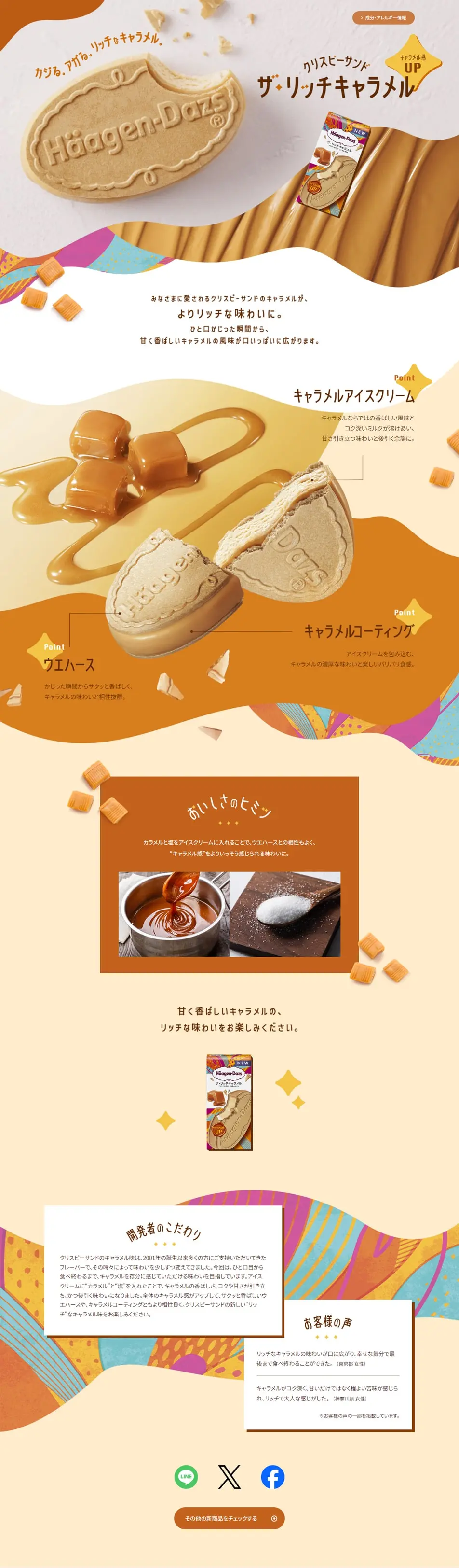
- Bite into it. Feel the uplift. A rich caramel. The beloved caramel in our Crispy Sandwich now offers an even richer taste. From the very first bite, the sweet and aromatic caramel flavor fills your mouth.
- Design
- This landing page successfully creates a comfortable impression for visitors with its warm color palette and approachable design. At the top of the page, soft gradients of cream and caramel colors evoke the rich flavor and smooth texture of ice cream. The product photos are remarkably realistic, featuring deeply appetizing visuals that stimulate the viewer's appetite.
【Note】 The landing page shown above was not designed by our company.
※You can view our production portfoliohere.
Clicking the design opens the source website.
*The original site may have been modified or removed.











