
LP design by #LetUsOvercomeTogether
View PC page
View SP page
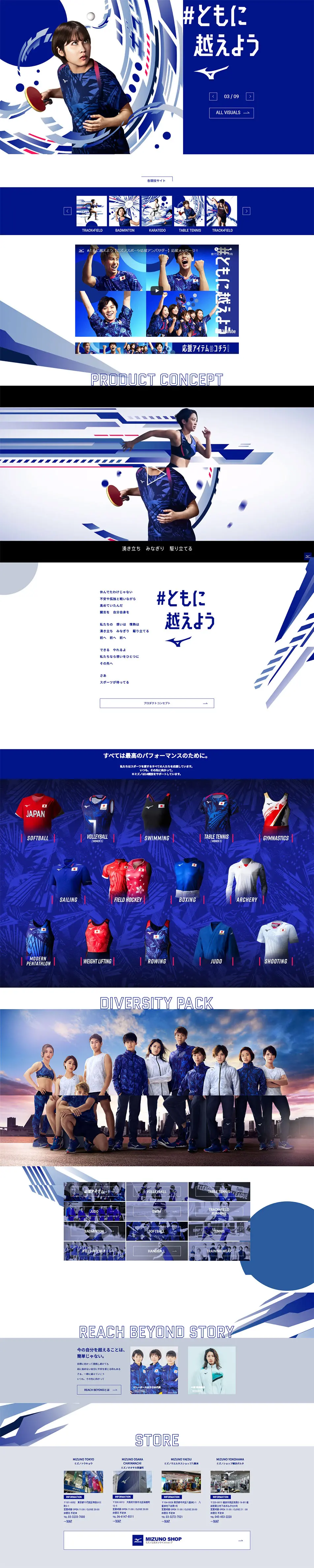

LP design by #LetUsOvercomeTogetherLP information
- Registration date 2021-12-06
- https://www.mizuno.jp/reachbeyond/2021/
- Product/service name
- #LetUsOvercomeTogether
- Categories
- Businesses, companies, stores
- Company name
- Mizuno(Tokyo-to Chiyoda-ku)
- Color
- We design LPs using Shades of blue
- Image
- These LPs have a "Simple" style design
- Catchcopy
- #LetUsOvercomeTogether
- Site Description
- DIVERSITYBLUE (Diversity Blue): All aspirations for victory. Diverse blues. XENERGYRED (Energy Red): Japan's surging energy. Vivid reds. We expressed a dynamic Japan by fusing these three motifs. The power to unite our aspirations and move beyond. Now, sports await.
MizunoMIZUNOSportsIkee RikakoWada MakiIchikawa KanaInoue NaoyaIizuka ShotaTakeuchi RyomaOhashi YuiWatanabe IppeiOkuhara NozomiShimizu KiyouUno ShomaLet's Overcome TogetherDiversityConcept
【Note】 The landing page shown above was not designed by our company.
※You can view our production portfoliohere.
Clicking the design opens the source website.
*The original site may have been modified or removed.











